
Red meat & mortality & the usual bad science
The media lit up on the evening of Monday March 12th as a press release was issued about an article in the Archives of Internal Medicine published that day.
The BBC were among the first to pick up the story and the story was featured extensively on BBC Breakfast TV and Radio 4 on Tuesday 13th March. Interestingly, John Humphries asked the pertinent question of science reporter Tom Feilden “We’re all going to die – let’s accept that. So what does this lower risk mean?” Tom couldn’t answer the question. He replied “It’s very difficult to unpick these statistics – these numbers are used as bald headlines.” Quite so!
So let us try to unpick the data and see what this article is all about:
At the outset we must highlight the error that this, and every similar study, makes. All that a study like this can even hope to achieve is to suggest a relationship between two things. To then leap from an observed association to causation or risk is ignorant and erroneous. This article makes this mistake – as has every other study I have reviewed demonising red or processed meat over the past year such as this or this.
The studies used in this article
There have been two large studies in America where people have been asked to record dietary intake, smoking, activity, weight and many other factors over a long period of time. The data from these two studies has been analysed retrospectively to look for patterns. This was not a study designed to review meat consumption over a period of time – some data just happens to be available and it has been reviewed to make headlines about meat consumption.
The two studies are the Health Professionals Follow-up Study (1986-2008) (abbreviated to HPFS) involving 49,934 men and the Nurses’ Health Study (1980-2008) (abbreviated to NHS) involving 92,468 women. A number of participants from these two studies were excluded in this meat review. After excluding people with cardiovascular disease (CVD) or cancer at the start of the study and excluding people whose dietary responses were incomplete, this article proceeded to review data from 37,698 men in the HPFS and 83,644 women in the NHS. Diet was assessed by validated food frequency questionnaires and updated every 4 years.
The dietary questionnaire offered 9 possible responses for meat consumption, ranging from “never or less than once per month” to “6 or more times per day.”
Unprocessed red meat was assumed to be “beef, pork, or lamb as main dish” (pork was queried separately beginning in 1990), “hamburger,” and “beef, pork, or lamb as a sandwich or mixed dish.” The standard serving size was 85 g (3 oz) for unprocessed red meat. As this was an American study, the great American hamburger has been included in unprocessed meat – it is of course as processed as meat can be. Hamburgers account for approximately half of American ‘beef’ consumption[i] and should be categorised as processed meat. If someone has had a beef sandwich or a pork kebab or a lamb curry – this has also been deemed unprocessed meat. Hardly what Paleo types would call real meat!
Processed red meat included “bacon” (2 slices, 13g), “hot dogs” (one, 45g), and “sausage, salami, bologna, and other processed red meats” (1 piece, 28g).
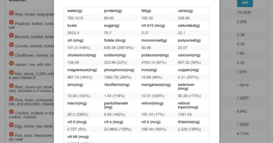
The Data – Table 1
Table 1 (http://archinte.ama-assn.org/cgi/content/full/archinternmed.2011.2287) has the raw (baseline) data for the two studies separately categorised into quintiles for total red meat consumption (processed and unprocessed meat lumped together). The five quintiles take the lowest fifth consumption of red meat and then the next lowest and then the middle of the five groups then the second highest and then the highest. Table 1 is age standardised (to remove the impact of any age differentials between the different five groups of red & processed meat consumption) and it then lists other characteristics of the five groups.
Here is where the first problem emerges. As you can see for yourself in Table 1, Q1 is the lowest red & processed meat intake and Q5 is the highest. There are many other variables that correlate to the groups Q1 to Q5 – this is for the HPFS – the top part of Table 1:
– Physical activity, as measured by hours of metabolic equivalent tasks, falls from 27.5 in Q1 to 22.7 in Q2 to 20.2 in Q3 to 18.8 in Q4 to 17.2 in Q5. As red & processed meat consumption increases, so exercise falls. Could lack of exercise impact mortality?
– Body Mass Index – the average BMI for Q1 was 24.7; the average BMI for Q2 was 25.3; for Q3 it was 25.5; for Q4 it was 25.7 and for Q5 it was 26. As red & processed meat consumption increases, so does BMI. Could BMI impact mortality?
– Smoking – the percentage of people in Q1 who smoke was 5%; in Q2 it was 7.3%; in Q3 9.8%; in Q4 11.3% and 14.5% in Q5. As red & processed meat consumption increases, so does smoking – the top quintile virtually three times higher than the lowest. Could smoking impact mortality?
– Diabetes – the percentage of people in Q1 and Q2 with diabetes was 2%; in Q3 it was 2.2%; in Q4 2.4% and 3.5% in Q5. As red & processed meat consumption increases, so does diabetes. Could diabetes impact mortality?
– The interesting one was cholesterol. 14.8% of Q1 were recorded as having high cholesterol; 11.1% of Q2; 9.7% of Q3; 9% of Q4 and 7.9% of Q5. So, as red & processed meat consumption increases, cholesterol recorded as high fell. Could low cholesterol impact mortality? Given the protective nature of life vital cholesterol and the repair role that it plays in the body, it is highly likely that high cholesterol is protective against cancer and heart disease. Quite the opposite of what we have been led to believe in the interests of statin and plant-sterol-injected-low-fat spread profitability.
– Total calorie intake – the average daily calorie intake for Q1 was 1,659; the average daily calorie intake for Q2 was 1,752; for Q3 it was 1,886; for Q4 it was 2,091 and it was 2,396 for Q5. As red & processed meat consumption increases, so does calorie intake. Could calorie intake impact mortality?
– Alcohol intake – in Q1 an average 8.4 grams of alcohol were consumed daily; in Q2 this was 10.7; in Q3 it was 11.2; in Q4 it was 12.4 and 13.4 grams of alcohol were consumed daily in Q5. As red & processed meat consumption increases, so does alcohol intake. Could alcohol intake impact mortality?
The Nurses Health Study showed exactly the same correlations – the numbers were slightly different but the trends were the same. As red and processed meat consumption increased so exercise and high cholesterol fell; BMI, smoking, diabetes, calorie intake and alcohol intake all increased.
Table 2 looks at all mortality (I will stay at the all mortality level – the study does not stand up to scrutiny at this level so there is no point looking at cardiovascular (CVD) mortality vs. cancer mortality).
Table 2
Table 2 presents mortality data per quintile. The high level numbers are that:
– The HPFS covered 758,524 person years and there were 8,926 deaths in total: 2,716 attributed to CVD and 3,073 to cancer.
– The NHS covered 2,199,892 person years and there were 15,000 deaths in total: 3,194 attributed to CVD and 6,391 to cancer.
– The two studies combined, therefore, covered 2,958,416 person years and there were 23,926 deaths in total: 5,910 attributed to CVD and 9,464 to cancer.
The first point to make, therefore, is that the overall death rate was very small:
– In the HPFS, in 758,524 person years the overall death rate was 1.18% and the CVD death rate was 0.36% and the cancer death rate was 0.41%. Over a 22 year period, just over one in a hundred members of the study died.
– In the NHS, in 2,199,892 person years the overall death rate was 0.68% and the CVD death rate was 0.15% and the cancer death rate was 0.29%. Over a 28 year period, approximately one out of 150 members of the study died.
– In the two studies combined, in 2,958,416 person years the overall death rate was 0.81% and the CVD death rate was 0.2% and the cancer death rate was 0.32%. In the combined studies, fewer than one person in one hundred died in a 28 year period.
Table 2 is then supposed to have adjusted for all the other factors noted under the analysis of Table 1. The article says that the multivariate analysis adjusted for energy intake, age, BMI, race, smoking, alcohol intake and physical activity level. However, I don’t see how this can have been done – certainly not satisfactorily.
In Table 2 the raw data for deaths per person years for each quintile is presented. I have done a raw ratio (marked Z) on these numbers to show the following:
Health Professionals Follow up Study
| Q1 | Q2 | Q3 | Q4 | Q5 | TOTAL | ||||
| Total meat | Deaths | 1,713 | 1,610 | 1,679 | 1,794 | 2,130 | 8,926 | ||
| person yrs | 151,212 | 152,120 | 151,558 | 152,318 | 151,315 | 758,524 | |||
| Death Rate (Z) | 1.13 | 1.06 | 1.11 | 1.18 | 1.41 | ||||
| Multivariate (*) | 1.00 | 1.12 | 1.21 | 1.25 | 1.37 | 1.14 | |||
| Unprocessed | Deaths | 1,855 | 1,722 | 1,535 | 1,819 | 1,995 | 8,926 | ||
| person yrs | 150,676 | 149,097 | 154,352 | 150,925 | 153,474 | 758,524 | |||
| Death Rate (Z) | 1.23 | 1.15 | 0.99 | 1.21 | 1.30 | ||||
| Multivariate (*) | 1.00 | 1.11 | 1.14 | 1.20 | 1.29 | 1.17 | |||
| Processed | Deaths | 1,917 | 1,395 | 1,661 | 1,717 | 2,236 | 8,926 | ||
| person yrs | 171,619 | 131,069 | 152,481 | 152,128 | 151,227 | 758,524 | |||
| Death Rate (Z) | 1.12 | 1.06 | 1.09 | 1.13 | 1.48 | ||||
| Multivariate (*) | 1.00 | 1.06 | 1.15 | 1.18 | 1.27 | 1.18 | |||
Above, I have simply taken the raw number of deaths for each quintile over person years and then calculated this as a ratio. The Multivariate line is the one presented in Table 2 of the article. It is the alleged comparison between the five quintiles – using quintile 1 as the base of 1.00 and relating the other quintiles to this base number. This multivariate line is supposed to have adjusted for the fact that exercise and cholesterol went down and BMI, smoking, diabetes, calorie intake and alcohol intake all increased alongside red and processed meat consumption. It is supposed to have removed all those correlations to isolate meat consumption alone.
My death rate line (Z) should therefore have all the other variables included and the multivariate line should have excluded all the other variables. The multivariate line should therefore be substantially below my death rate line (Z) for every quintile and it isn’t. Indeed the raw data for deaths per person years shows that the death rate was lower in Q2 and Q3 than Q1 for total meat, unprocessed meat and processed meat. Look at unprocessed meat (not withstanding that this includes hamburgers and other junk that it shouldn’t) – the death rate in quintile 3 (Q3) is 0.99 vs 1.23 for Q1. As meat consumption increases from Q1 to Q2 and Q1 to Q3, so the death rate falls. Only in Q4 and Q5 does this reverse and it is in these quintiles that we saw the highest levels of BMI, smoking, low activity, high calorie intake, high alcohol intake and so on and these have clearly not been adequately allowed for.
The nurses study shows exactly the same pattern. The death rate falls in Q2 and Q3 vs. Q1 in all cases. In fact even Q4 is lower than Q1 in all meat groups. Only Q5 is higher than Q1 on my ratio of raw data and this is with none of the smoking, exercise, weight, diabetes, alcohol having been allowed for.
Nurses Health Study
| Q1 | Q2 | Q3 | Q4 | Q5 | |||||||||
| Total meat | Deaths | 2,946 | 2,759 | 2,658 | 2,872 | 3,765 | 15,000 | ||||||
| person yrs | 438,326 | 442,134 | 439,712 | 440,329 | 439,391 | 2,199,892 | |||||||
| Death rate (Z) | 0.67 | 0.62 | 0.60 | 0.65 | 0.86 | ||||||||
| Multivariate (*) | 1.00 | 1.08 | 1.11 | 1.18 | 1.24 | 1.11 | |||||||
| Unprocessed | Deaths | 3,079 | 2,885 | 2,545 | 2,709 | 3,782 | 15,000 | ||||||
| person yrs | 441,041 | 441,207 | 439,306 | 431,097 | 447,240 | 2,199,891 | |||||||
| Death rate (Z) | 0.70 | 0.65 | 0.58 | 0.63 | 0.85 | ||||||||
| Multivariate (*) | 1.00 | 1.07 | 1.07 | 1.10 | 1.19 | 1.10 | |||||||
| Processed | Deaths | 3,076 | 2,799 | 2,778 | 2,814 | 3,533 | 15,000 | ||||||
| person yrs | 442,594 | 420,403 | 455,365 | 441,369 | 440,161 | 2,199,892 | |||||||
| Death rate (Z) | 0.69 | 0.67 | 0.61 | 0.64 | 0.80 | ||||||||
| Multivariate (*) | 1.00 | 1.04 | 1.08 | 1.14 | 1.20 | 1.21 | |||||||
The headline of the article
The key passage in the press release that attracted all the headlines was this:
“Unprocessed and processed red meat intakes were associated with an increased risk of total, CVD, and cancer mortality in men and women in the age-adjusted and fully adjusted models. When treating red meat intake as a continuous variable, the elevated risk of total mortality in the pooled analysis for a 1-serving-per-day increase was 12% for total red meat, 13% for unprocessed red meat, and 20% for processed red meat.”
This is what led to the big news story: “adding an extra portion of unprocessed red meat to someone’s daily diet would increase the risk of death by 13%. The figures for processed meat were higher, 20% for overall mortality…”
These numbers come from the bottom lines in Table 2 in the article. The bottom three lines in Table 2 come from the authors of the article combining all deaths in both studies from the multivariate model. They state that, using Q1 as the base line (1.0), the relative results for the other quintiles are as follows and they have added in a final column claimed to be the risk factor for increasing consumption of total, unprocessed or processed meat by one serving a day:
| Q1 | Q2 | Q3 | Q4 | Q5 | Risk factor | ||
| Total meat | 1.00 | 1.10 | 1.15 | 1.21 | 1.30 | 1.12 | |
| Unprocessed | 1.00 | 1.08 | 1.10 | 1.15 | 1.23 | 1.13 | |
| Processed | 1.00 | 1.05 | 1.11 | 1.15 | 1.23 | 1.20 |
The 13% at the end of the unprocessed line is where the 13% headline comes from and the 20% at the end of the processed line is where the 20% comes from. I don’t know precisely how they have come up with these numbers. The corresponding consumption for each quintile was 0.25, 0.61, 0.95, 1.36 and 2.07 servings per day (for the HPFS). I suspect that their model allows them to look at the data for 1 serving vs 2 or half a serving vs one and a half and to compare ratios in this way.
None of this, however, reflects the facts from the raw data that Q2 and Q3 have lower death rates than Q1 in both studies and Q2, Q3 and Q4 are lower than Q1 in the Nurses study.
In summary
There are numerous key problems with this study – I’ll share seven:
1) This study can at best suggest an observed relationship, or association. To make allegations about causation and risk is ignorant and erroneous.
2) The numbers are very small. The overall risk of dying was not even one person in a hundred over a 28 year study. If the death rate is very small, a possible slightly higher death rate in certain circumstances is still very small. It does not warrant a scare-tactic, 13% greater risk of dying headline – this is ‘science’ at its worst.
3) Several other critical variables showed correlation with death rates – lack of activity, low cholesterol, BMI, smoking, diabetes, calorie intake and alcohol intake. These have not been excluded to isolate meat consumption alone. The raw data actually shows deaths rates falling with increased meat consumption up to the third or fourth quintile – and this is before all the other variables have been allowed for. This would suggest that meat consumption has a protective effect while weight, alcohol, calorie intake, lack of exercise and so on are all taking their toll.
4) Several other critical variables were not measured, which would logically correlate with certain meat consumption. Unprocessed meat inexplicably included sandwiches, curries, hamburgers (which come in buns) – has the correlation with bread, margarine, white rice, egg fried rice, poppadoms, burger buns, ketchup, relish or even fizzy drinks been correlated with the death rates? Indeed, Frank Hu, one of the authors of this meat study, is also quoted in today’s paper saying that one soft drink a day raises the risk of heart attacks. It doesn’t of course – it is association at best, just as the meat article is – but one does wonder if that harmful soft drink was the one that just happened to be consumed with the hamburger or the bacon, lettuce and tomato sandwich ‘meal deal’?!
5) Hamburgers and pork sandwiches or lamb curries have been included as unprocessed meat. This is not a study of what real food devotees would consider unprocessed meat therefore. May I suggest that a study of consumers of grass fed ruminants would not deliver the desired headline? The lamb and beef grazing in the fields around me in Wales could not be further in health benefits from the hamburgers in buns and hot dogs in white rolls in fast food America.
6) We are all going to die. We have 100% risk of it in fact. We are not going to increase this risk by 13% or 20% if we have a hamburger and certainly not if we have a grass fed nutrient rich steak. This is headline grabbing egotistical academics doing their worst.
7) As I always consider conflict of interest, it would be remiss of me to end without noting that one of the authors (if not more) is known to be vegetarian and speaks at vegetarian conferences[ii] and the invited ‘peer’ review of the article has been done by none other than the man who claims the credit for having turned ex-President Clinton into a vegan – Dean Ornish.[iii]
All of this nonsense has given me an appetite, so I’m off to get my complete protein and essential fats plus the full range of B vitamins, ample fat soluble vitamins and lashings of iron, phosphorus, magnesium and zinc – also known as grass fed steak!
[i] http://www.meatami.com/ht/a/GetDocumentAction/i/48781
[ii] http://www.vegetariannutrition.org/speakers.html
[iii] http://archinte.ama-assn.org/cgi/content/full/archinternmed.2012.174

Interesting post!
But I think you are making a mistake in point 2. Dead rate is no small in all the period, if you divide person-yeas by the number of years, you can obtain total person. And if you divide total person by number of deads, you obtain about 18-19% of deads in the first quintile in the whole period (28 years). It’s a “normal” rate becouse we are talking about people with more than 40 years old, so in 28 years much of them have to die.
Anyway, I agree with you in the rest of the article.
Regards
Fantastic, thanks so much for taking the time to “shred the meat” of this research(?) for those of us who only know basic stats, it is much appreciated.
Thank you much, Zoe, for your hard work. I haven’t had time to look at everything in the original study, and I’ve only had time to skim your own comments, Zoe. But one thing you said struck a chord with me. When I looked at the raw data, I noticed something that I believe you also noticed, which was that often quintile 3 or quintile 4 “did better” than quintile 1 or 2. So why isn’t the headline something along the lines of “it isn’t safe to eat no red meat”? In spite of the fact that the authors say they corrected for confounding factors, I still have a suspicion that they aren’t correcting adequately — on a quintile-by-quintile basis — for the fact that if you are eating just TONS of red meat, then you don’t have much room for vegetables and fruits. I looked at a study on Pub Med about 4 or 5 year ago trying to link red meat and cancer. I plotted the raw data, and it looked like red meat actually had a Protective effect for Women against cancer, but not for the men. But in that study, the women in the Top red-meat-quintile at as much red meat as the Men in the Second quintile, and they ate more vegetables. The authors of the study didn’t even Comment on the inverse relationship for red meat and cancer among the women, I think because they just didn’t like the result. That was an article on Pub Med, and after I posted my observations on their blog, they stopped taking any additional comments. For this latest study the “13%” figure for increase in mortality seems fishy. Maybe the problem is that it hasn’t been reported correctly, but I haven’t seen it clearly explained if that is “per year” or what. Maybe I need to read it more carefully. There is a lot to look at, but it looks, Zoe, like you’re trying to do a responsible job of analyzing this.
“hamburger has been included in unprocessed meat – it is of course as processed as meat can be.” You’ve obviously never made a hamburger. Hamburger is simply ground meat. The argument should be over the quality (grass fed vs. conventional), not the way it is served.
@Pamela Olsen – Unfortunately, you are amongst a group of readers and posters that are all too familiar with “The China Study,” and it’s equally dubious companion film “Forks Over Knives” to make much of a dent with your opinion. Both above-mentioned titles have been neatly and thoroughly blown apart time and again by Denise Minger on her blog http://www.rawfoodsos.com
http://rawfoodsos.com/2011/09/22/forks-over-knives-is-the-science-legit-a-review-and-critique/
http://rawfoodsos.com/2010/08/03/the-china-study-a-formal-analysis-and-response/
If you are further interested, Chris Masterjohn, another brilliant dietary biochemist writes this about Campbell’s study
http://www.cholesterol-and-health.com/Campbell-Masterjohn.html
If you feel the China Study tells an unbiased and truthful tale, then you should feel free to follow whatever advice you find there.
For the rest of us, critical thinking and the ability to see bias behind such studies will suffice.
As a human with 30,000+ years of evolution in my past eating meat as a staple of the diet, I will continue doing what gave my ancestors the largest, most creative brain in the animal kingdom, and provides humans today the wisdom and ability to remain at the top of the food chain.
Does the study refer to “hamburgers” as unprocessed meat, or “hamburger”? AFAIK, in American English “hamburger” or “hamburger meat” just means minced beef. Not at all the same as “hamburgers” or “a hamburger”.
Regarding Alan’s question and your response,
Wouldn’t the adjustment for confounders depend on the frequency of the counfounders in the different quintiles? Therefore it is entirely possible that adjustment goes up.
Do you think you are out of your depth? Maybe you should have studied epidemiology at the London School of Hygiene instead of economics at Cambridge.
Well, who knew that there is a 100% chance that you are going to die? Great article.
The failure to include carbohydrate and (related) insulin-level data in a discussion or analysis or study of heart disease causation in 2012 is charlatanism. (?ego-statistical?) Red meat consumption in westernized cultures is almost always accompanied by sugars, flours and grains and must be addressed by conscientious researchers or questioned by informed media. In those societies where the meat/carb accompaniment is absent, red meat and saturated fat consumption is not followed by heart disease, obesity or diabetes.
Unfortunately, this well reasoned presentation won’t grab any headline attention. My father, a beef farmer who ate ample quantities of red meat, bacon and other processed meats (his standard lunch in his old age was an uncooked hot dog), lived to be 92. My father in law who had a very similar diet died at 93. Shucks, it they had been vegetarians the might have lived a month longer!
One comment about the ‘age-adjusted’ numbers that someone mentioned. These two are suspicious. The mean ages dropped from quintile 1-5 in the HPFS and from 1-4 in the Nurses Health study. And yet the age adjusted death rates went up? So they are assuming that if the people in the higher numbered quartiles were older, then they would die more frequently. Possibly a valid assumption but the difference in mean age was 1.2 years from Quartile 1-2 in the HPFS and 1.3 in the nurses study and yet the death rates were revised up from relative values of 1-0.93 to 1-1.06 which is an increased risk due to 1.2 years of 13%. So all other causes being equal, you have a 13% greater chance of dying when you are 53.8 then if you are 52.6? That seems like a bit of a stretch to me.
All you have to do to realize that these studies are basically worthless is to look at the example of HRT therapy and heart disease. Back in the early 1990s, the Nurses Health Study (Yes, the exact same data that was part of this meat study) was analyzed with similar methods as was done in the meat study. And, there was a correlation between hormone replacement therapy and lowered incidence of heart disease. To be clear, the study took the data from the NHS and corrected for various factors (just like in the meat study!) and found that nurses who were on HRT were 50% less likely to die from heart disease.
To make a long story short, some real science was done a decade later, and this showed that HRT therapy actually leads to a 30% increase in risk of heart disease.
So, the observational study showed a large benefit to having HRT, which was subsequently shown to be completely incorrect.
It seems that there might be a lesson in that somewhere.
Trans fats and rancid unsaturated fats are known to cause CVD and cancer(among other things), with real solid research to back it up. Commercial vegetable oil is extracted with a process that involves high heat, causing the unsaturated fats to go rancid. This is then put through a deodorizing process to remove the bad smell, this process converts some of it into trans fats. When producing margarine, they use this vegetable oil, and put it through another chemical process specifically to produce more trans fat.
Now here’s a thought: How many of these red meat dishes were eaten with french fries, particularly hamburgers? French fries fried in rancid vegetable oil. How much of the red meat was fried in margarine?
Thank you for the thorough analysis. I work with multivariate data analysis all day (environmental toxicology) and are always amazed regarding the misconception between correlations and causations. That the authors have skipped the important correlations and only looked at one is truly bad. Thanks again!!
I got so tired of reading those stupid headlines claiming that red meat would kill you. It’s too bad there are so many people employed as journalists who don’t bother to read. Had they done their jobs, these “journalists” would have noticed the following:
“Men and women with higher intake of red meat were less likely to be physically active and were more likely to be current smokers, to drink alcohol, and to have a higher body mass index (Table 1). In addition, a higher red meat intake was associated with a higher intake of total energy but lower intakes of whole grains, fruits, and vegetables.”
It was a correlation study, nothing more. Red-meat lovers were statistically more likely to be (1) sedentary; (2) smokers; (3) drinkers; (4) obese; (5) junk-food junkies and (6) neglectful of real foods.
The Harvard study showed nothing inherently wrong with red meat.
@ Brian, how do you know what value to give a confounder like cholesterol? No two studies agree on its meaning. And what about all the confounders not measured, like wheat and sugar, or type of alcohol?
Not thorough enough, not even.
These fools need to test this hypothesis in a clinical trial. That has been done (albiet unintentionally) – the “A through Z” diet study. The results didn’t really support the hypothesis (which is all it is) generated by this time-waster.
Thanks Zoe.
I came here from Gary Taubes, who gets into this in a different way and links here.
http://garytaubes.com/2012/03/science-pseudoscience-nutritional-epidemiology-and-meat/
This study is baloney, but hopefully it will push down the cost of meat again.
All the more for me!
If you listen to these goons, and bank that their tiny risk factor means something, you are gambling with your health on slim odds, instead of investing in it.
Here’s another good one from Denise Minger.
Will Eating Red Meat Kill You?
http://www.marksdailyapple.com/will-eating-red-meat-kill-you/#more-27840
For those who think Zoe was being unnecessarily harsh here’s a couple more detailed rebuttals of this research.
Will Eating Red Meat Kill You?
This is another special guest post from our favorite study-dismantler, Denise Minger.
http://www.marksdailyapple.com/will-eating-red-meat-kill-you/#more-27840
Always Be Skeptical Of Nutrition Headlines: Or, What “Red Meat Consumption and Mortality” (Pan et.al.) Really Tells Us
http://www.gnolls.org/2893/always-be-skeptical-of-nutrition-headlines-or-what-red-meat-consumption-and-mortality-pan-et-al-really-tells-us/
When I found out that statin drugs damage my liver, that was enough for me. All the hard research I’ve read states that it’s best to have a combined cholesterol level above 200, despite what ‘they’ would have you believe.
Thanks for diluting the scare tactics.
Hi Zoe, fine resume.
Because sugars and refined carbs are left out from the study as you point out it is impossible to deduce much from the data, although the long list of what was included serves it purpose to hide the trees with a literal wood.
These carbohydrates are the real Elephants in the room, and they are BIG!
About 50% of red meat in the US is consumed as burgers. It could be possible to assign a typical coke, bun, chips, ketchup, mustard (sugar sauces) serving to go with each of the hamburgers. Then the results would likely be different.
But is the burger data available or was it lost in sloppy questions?
Science says that daily Coke (soda) and chips are likely to be the main culprits; fatty liver and transfats.
I am awe-struck and delighted at this wonderful analysis and have indicated so on Facebook.
Nice analysis of the study, which is available at Archives of Internal Medicine. Every time I read one of those apocalyptic headlines – that red meat will kill you – I go back to the following line from the study:
“Men and women with higher intake of red meat were less likely to be physically active and were more likely to be current smokers, to drink alcohol, and to have a higher body mass index (Table 1). In addition, a higher red meat intake was associated with a higher intake of total energy but lower intakes of whole grains, fruits, and vegetables.”
It’s a correlation study, nothing more. At best, it found red-meat lovers to have a higher correlation with these other factors, factors which would concern me a lot more.
After all, if you’re a fat, lazy smoker/drinker who grazes on junk food and avoids fruits, vegetables and whole grains, red meat is the least of your worries.
Unfortunately, it’s not bad science… it’s actually very good science. Her first point is a common argument used against all modern research by anyone with a bone to pick – unfortunately, there is no such thing as a perfect study. It’s simply not possible. It never has and never will be done. We use the tools we have to make the best of what is there, and over the past two decades we’ve become pretty damn good at it.
Her second point (in the summary) shows that she doesn’t understand relative risk, or chooses to ignore it. 13% increase in mortality risk is accurate. People don’t understand what this actually means. Say you do a study with 20,000 people – two groups of 10,000. In your control group, 100 people die (1% mortality). In your test group, 113 people die (1.13% mortality). This is a 13% increase in mortality risk – it is how hazard ratios and relative risk are calculated. It is true that this risk seems small – it is also true that this risk exists. The size of their data allows them to detect very small but statistically significant differences like this. When you talk about one person, going from 1% to 1.13% seems negligible at best. When you talk about 300,000,000 people in America alone, that difference describes the deaths of 400,000 people.
Her third point intentionally neglects Figure 1. All cause mortality correlates with red meat intake at the 95% confidence interval (indicating that there is a less than 5% chance that these results are due to chance… looking at the hazard ratios I suspect the results are also valid at the 99% confidence interval). The simple phrase that negates everything she wrote and shows that she doesn’t understand evidence-based medicine is right next to Figure 1: “The results were adjusted for…” and then they list every variable that she tries to imply is actually at fault. Are exercise level, smoking, etc. correlated to mortality? Of course they are. That’s why this data adjusted for them. This study is explicitly looking at red meat consumption, not everything else. What she doesn’t understand is that yes, smoking causes increased mortality, but red meat consumption ALSO causes increased mortality, and these two things are independent of each other.
Her fourth point is the same as the first. “Oh they didn’t control for everything in the world, so the results are invalid.” No, if they didn’t control for age or smoking, the results would be invalid. Not controlling for whether or not the hamburgers had buns is grasping at straws.
5. “This is not a study of what real food devotees…” No, it’s not. It’s just a study, like every other study. “Real food devotees,” whatever they are, are an artificially created group based on subjective opinions of food. You don’t get to choose what you want to look at and reinterpret the data.
6. This isn’t even a point. It’s just padding.
7. Accusing the Harvard School of Public Health of professional bias is pretty ballsy, but silly. They are certainly less biased than this woman.
With all that being said, I eat a ton of red meat. I just also like honesty and accuracy, and this woman is lacking in one if not both. She’s obviously not trained in statistical medical research (and yes, I am).
But the corrections add the wrong trend, implying that obesity and smoking is good for you?
It’s fascinating to me how energetically people wish to discount these findings, presumably so that they continue to do what they want to do.
THere is quite a bit more evidence than just these studies that animal protein, and especially red and processed meat, promote the growth of cancer. The China Study, by Colin Campbell, is a place to start. The book “How to Prevent and Treat Cancer with Natural Medicine” cites additional studies showing a clear association between eating red meat and getting colon cancer.
All I know is that when I suffered greatly for several months from ovarian cancer, every single time I ate red meat (about once a month), I bled from my intestines. Chicken didn’t do it, fish didn’t do it, beans didn’t do it. Red meat did it. I was, in fact, diagnosed, when, after eating a hamburger (my first red meat for a few weeks), I bled profusely the next day from my rectum.
Y’all can keep eating the stuff if you want to. Personally, I’m staying away from it.
The China Study!!!! Collin Campbell’s study was so bad that he didn’t fit his own cherrypicked data. http://www.acupuncturebrooklyn.com/diet/the-china-study-misrepresents-data-does-not-support-a-vegan-diet
Ovarian cancer is exceptional by the way and does in fact correlate with red meat consumption (whether that correlation would hold if you got rid of pink slime hamburger and focused on pastured meat is unknown.) Most cancers have the opposite correlation. So you stay away from red meat but know that your cancer was identified even back in Atkin’s day as different.
Now you are a true scientist. Thank you for this article!
@Allegry
Comments on your comments:
1. No claim of causation in the abstract, etc., sure, but the authors hypothesise possible causes for the relationship in the Comment section – attempting to explain the association in causal terms, so your claim isn’t entirely accurate.
2. Largely correct – health/nutrition reporting in the media is of course notoriously sensationalist and the “correlation does not imply causation” idea seems to be very poorly understood amongst journalists.
3. Yes, I think Zoe was very quick to suggest that the multivariate analysis was flawed and I fear she may have jumped the gun on that one (hence my earlier comments).
4. Yes, it’s a limitation of the study – it doesn’t invalidate it but it does mean that its findings should be interpreted cautiously. This need for caution is rarely spoken of in the in the mainstream media of course – it’s just “RED MEAT KILLS”.
5. Some rhetorical flourishes I suppose, nothing to get too hot under the collar about. This isn’t a dry academic journal!
6. I would have agreed with you on your ‘misdirected hate’ comment, were it not for the fact that Dean Ornish seems to have been involved in this work (but perhaps that’s MY prejudice and bias creeping in). The “100% risk of dying” comment is meaningless of course – it could be used to justify playing Russian roulette, for example (“100% risk of dying if I don’t, 100% risk of dying if I do, so what the hell?”). What matters is of course not how often we die per *lifetime* (precisely once, regardless of what we do) but how often we die per *year* (which our behaviour CAN influence)!
7. I’m not sure that Zoe would say that her blog entry counts as a scientifically rigorous peer review document – she is a businesswoman I suppose, not a professional scientist (and that’s not a criticism – she is what she is and the blog is what it is). You may be refuting something that hasn’t been claimed.
Alan.
@Mat your assumption sounds like “they’re vegetarian tree huggers so they must have fiddled the numbers”, which isn’t science! Also I wouldn’t say that Zoe has no agenda – she has pretty strong views on diet & nutrition (most of which I agree with, btw) and the things she chooses to write about (or not) should be interpreted in that light. That’s not a criticism of her by any means – it’s just something that should be borne in mind if we’re interested in entirely dispassionate science.
@Allan
If they haven’t shown their working out for how the multivariate model they created was done; I’m gonna assume it is a load of tosh and that Zoë – with no agenda to push – is right
Hi Zoe
Thank you – good analysis – and summary. This sort of story is precisely the sort of thing that Richard Feynman warned us about in his excellent short book ‘The meaning of it all’ (well worth a read).
As you point out early on, the assumptions are based on two large studies and come from retrospective analysis to identify possible patterns. But as Richard made clear, the next step must be to set up further large test groups – with different people – to see if those patters are replicated – conclusions can’t be drawn from the original sample. (See his rat maze probability story.)
Kind regards
Huw
Zoe,
excellent article, one of the best I have seen on debunking stupid science claims.
It is scary what goes through as peer reviewed science in the nutrition and exercise space, and it is great to see someone taking the (considerable, I suppose) time to show why the study results at best are misrepresented, and at worst are B/S.
Two things scare me though – the apparent lack of understanding of statistics (and the interpretation thereof) in those parts of science (or is it somewhat more sinister? they understand but they publish nevertheless?), and the trust that those people get from the general public.
Because of course one thing is sure: if you give the original headline/article and your article to a group on randomly selected people, then the majority of them will probably think you are the nutter and the “scientists” are of course right – I mean, of course they can adjust the data correctly, they can even send a rocket to the moon and build computers.
Hi Zoe,
A couple of questions.
1. Why didn’t you just use the age-adjusted only data to compare it with the multivariate data? If you do, you can see the risk attenuate every time when its adjusted for all those potential confounders in Q5.
2, And my next point. Sure, the indices of healthy eating and lifestyle (vegetable, fruit, fishm smoking and exercise etc etc) change deleteriously in Q5 but the absolute changes for most are small. For example vegetable intake in the HPFS only drops from 3.29 to 3.07. That’s a fraction of a serving difference. Same with BMI in the NHS, it only increased by 0.8 (23.9-24.7). These differences may add up, and they are indeed reflected in the attenuation of risk in the multivariate model, but there is doubt over the real influence of these confounders on the result especially to the degree you claim.
Thanks.
Jeremy.
Wow, the conclusions you present …..I’ll just provide a quick rebuttal to your 7…
1) The study made no claim of causation, it only included language showing a statistically significant association.
2) Your anger should be directed at the mainstream media. Statistics aren’t emotional – reporters are and they sell the emotional scare to make money.
3) The fact that the multivariate analysis didn’t support what you think it should doesn’t make it invalid. The data is there, you just don’t like the conclusion.
4) There is a limitation on the number of variables than can be included from pre-existing data by default, obviously you are limited to the previous research team’s scope. That doesn’t mean that this study is invalid – it means that more research is required before a definite causative relationship can be established.
5) ‘Food devotee’ definitions have no place in scientific discussion. This is about appealing to hipster sensibilities, it’s about recognizing differences in meats that are minimally processed (raw cuts) versus those meats that are processed via: grinding, curing, smoking (hot or cold), boiling, roasting, addition of preservatives, injection of artificial or natural flavorings, blending multiple products, bleaching, dyeing, canning, and other methods.
6) Again, misdirected hate here. The journalists will spin a 100% increase because it sells papers and pageviews (just like you!). Regardless, 2 is a 100% increase over 1. That’s really basic math and it doesn’t change just because unscrupulous reporters can spin it in a way you don’t prefer.
7) Speaking of potential conflicts of interest – how many pageviews (and thus how much money have you made) from posting this purposely contrarian article? The fact that researcher is vegetarian doesn’t invalidate his/her conclusions, it’s only a factor to be considered in a scientific or medical peer review. Sorry to disappoint you, but your blog doesn’t count as a valid scientific peer review source…..conflicts of interest and all.
Disclaimers:
– I’m an omnivore
– I love science
– I’m not associated in any way with Harvard, this study, or the researchers
– I have no previous interactions with Ms. Harcombe, her webiste, diet plans, forums, followers or fans (I was given this link in a geek forum)
Hi, really appreciated your analysis particularly the comments about the use of multi-variate analysis and the “removal” of confounding factors. The figures that raised my suspicions were those that claimed that eating all red meats increased risk of death by LESS than eating just unprocessed meat or processed meat alone. Really cannot see the logic in this. A similar study (referred to in the publication and using the same database and similar statistical models) in 2009 that did not distinguish between types of “red” meat reported a total mortality risk for all the study participants of greater than 1.0, which of course is impossible. My other comment on the present study is that although it purports to take account of differences in calorific consumption between the quintiles (where Q5 has a significantly higher calorie intake than Q1) it does not analyse what this calorific difference is due to. If it is due to eating extra refined carbohydrates and sugars then that alone could well explain any increased risk of CVD. Finally (for now at least) take a careful look at the figures in the tables that analyse the type of red meat eaten: I do not think they show statistically significant variation in cancer deaths when considering “unprocessed” red meat.
Finally, in one of your comment posts you say ” fact that my ratios could be written as 1.00; 93.43; 97.70; 103.97 and 124.26 (doing the same 1.00 base line thing) and the mutlivariate ones were 1.00; 1.12; 1.21; 1.25 and 1.37″ I assume you accidentally got the decimal point in the wrong place?
Bravo Zoe!!!
Interesting article and I do think you have some points here, but I’m not sure I agree with how you’re interpreting hazard ratios and confusing them with death rates. Have you done much with Cox proportional hazards models before? I once ran these quite frequently for work, but am rusty since that was about 10 years ago. Now, if I use a Kaplan-Meier (nonparametric) model in the most simplistic way (boiling it down to a single time point..a very, very incorrect survival model but used here as an example), the survival at time t is defined by S(t)=(#surviving)/(total # in study). The hazard rate is then defined as -ln(S(t) and if you want a hazard ratio you would divide two hazard rates. So, if I use their data in this (inappropriate) survival model I get the following where the top line matches what you got (I converted the values relative to Q1)
relative_death_rate 1 0.9342615 0.9779141 1.039681 1.242586
haz_ratio 1 0.8806090 0.9961704 1.026604 1.266873
So, as you can see, it is possible that the hazard ratio is larger than the death rate. Now, OF COURSE, these horribly done Kaplan-Meier estimates that boil the data down to one time point will be quite different than their Cox proportional Hazards model. These estimates in no way provide evidence that their supplied hazard ratios are incorrect, as they used a much, much more appropriate model. After all, when the death occurred is not incorporated in any way. Especially after adjusting for confounders I would expect differences. So, you do not have an argument for whether or not they actually adjusted for things as they state. Could they have lied about modeling smoking as a confounding covariate? Maybe, but we have no reason to assume so. I have seen cases where adding confounders can cause other parameter estimates to increase or decrease, so we have no expectation about which way it should have gone, especially when a group of covariates are added at once, as done here. Also,there isn’t really an “unsatisfactory” way to adjust for a covariate. You add it to the model or you don’t. Granted I do prefer continuous to categorical regressors and perhaps one of those could be viewed as unsatisfactory.
Also, when you model a covariate as a continuous regressor in a Cox model, the interpretation is the hazard increase by X for each 1 unit increase in the covariate. So, really, when modeled continuously you can look at an increase of 1 serving, 1.5, .5, etc. You don’t actually split up the data and model it as you seemed to imply when you said, “I suspect that their model allows them to look at the data for 1 serving vs 2 or half a serving vs one and a half and to compare ratios in this way.” Their model can actually allow the comparison of any sized serving to any other sized serving (within the range of the data). Of course if the ratio is the same it doesn’t matter 2/1 vs 4/2 are the same and depending on the data range the comparisons can be debated.
Lastly, I didn’t read the paper extremely thoroughly, but I don’t think the authors didn’t make any causal claims from what I saw. This is most likely coming from the media. The authors carefully seem to use “associations”. I agree there isn’t really proof of a causal link here and it will be interesting to see the analysis repeated as the power increases (more people die).
Hi Zoe,
My simple comment: nice job. Thanks.
gt
Thank you for lloking over the raw data and crunching the numbers.
@Adele you make a very good point indeed and one which I don’t think is widely appreciated. The statistical rigour of this kind of study falls well short of the ‘gold standard’ used for medicines ie double-blind randomised controlled trials. Maybe proper RCTs aren’t really feasible with diet-related trials (can’t really do them blind, difficulty in defining a control group, etc.), but this DOES make it harder to draw firm conclusions from the data and it’s important that this point is understood – and I think it often isn’t!
Thank you Zoe, great article! Off to eat some steak!
Thanks you Zoe, great article! Off to eat some steak!
Excellent work! Thanks for summing it up so nicely. The whole “adjustment for confounders” is a statistical activity that adjusts the data. It does not “adjust” the person who makes up the data point. The giant elephant confounder in the room: If we tell people that a healthy diet is low in red and processed meat, as we have been doing since 1980, then (most) people who are concerned about their health will eat a diet that is lower in red and processed meat. And people who care about their health are healthier than people who don’t care about their health. Always. Even if we could tease apart intake patterns (quality of meat, buns with hot dogs, etc.) there is simply no way to adjust for that factor. This is politics, not science.
Very import comment Adele
Zöe,
great piece. Thanks for this.
Question: you state that death rates were very low, but isn’t something amiss? The death rates you’re talking about are “per annum,” right? I mean, over the course of the study they had 23,926 deaths; there were 121,342 persons participating, so, 19% of study participants died during the course of the study.
Out of all participants in the study, 4.8% died from CVD during the study (24.7% of all deaths), and 7.8% died from cancer (39.5% of all deaths). Almost 2/3 of ALL deaths, from all persons, with every kind of diet, were from CVD and cancer!
The way I think about this is, if I am 100% likely to die at the end of my life, fine. We all are. But what are my chances of dying in any given year? If they go up based on diet, how much do they go up? From what you’re saying, I gather that, even if this study were proven to be valid, my odds don’t go up all that much.
I’d love to have you clarify your thoughts on what this study is actually saying about mortality risk.
Matt
Hi Matt – great question!
The USA death rate for all causes for 2006 was 0.78% ( I just happen to have this figure analysed in my book The Obesity Epidemic) (Centres for Disease Control and Prevention, (Using age adjusted data), http://www.cdc.gov/nchs/hus.htm (data page), ftp://ftp.cdc.gov/pub/Health_Statistics/NCHS/Publications/Health_US/hus09tables/09contents_tables.pdf, (detailed list of data available)
This means that c. 777 people died per 100,000 USA citizens in 2006 i.e. for that year. You are right that there were 23,926 deaths from the 121,342 included in this study. The larger part of the study (the NHS) was over a 28 year period. Hence, using the 2006 death rate, we should have expected 777 people in 100,000 to die or 943 for 121,342. Over 28 years, that should be 26,399 people whereas in fact 23,926 died – less than the 2006 average, but then death rates have been falling since the 1950’s. CVD and cancer are the two biggies and they do account for about a third each.
The – what are the chances of dying in any particular year is – as you say – the key question and the criticism of these studies is that they imply that lives will be saved. This one concludes: “We estimated that substitutions of 1 serving per day of other foods (including fish, poultry, nuts, legumes, low-fat dairy, and whole grains) for 1 serving per day of red meat were associated with a 7% to 19% lower mortality risk”, which is nuts! All they are effectively saying is – in a given period of time, X people should have died and if they do Y then some of them won’t have. However, they may die the very next day after the end of the study period. The best I’ve seen this presented is by Dr Malcolm Kendrick in The Great Cholesterol Con (p193) where he exposes the arguments used for statins…
He quotes from the Heart Protection Study that claimed “If an extra 10 million high-risk people were to go onto statin treatment, this would save about 50,000 lives a year – that’s a thousand a week.” Kendrick puts it as follows: “Leaving aside the point that this 50,000 figure actiually equates to one life ‘saved’ for every 200 people taking the statin – 10 million is an awful lot of people to use as your denominator – the concept of saving lives is not best chosen. In reality, taking a statin can only delay death, not prevent it. By how much? Well, if one in two hundred people are alive after one year of taking statins, this means that if you wait another two hundreths of a year (plus another little bit) the statin group will have caught up on the placebo group in total number of deaths. This represents an increased life expectancy of slightly under two days. It would be considerably more accurate to state that, if ten million people (at very high risk of heart disease) took a statin for a year they would live, on average, two days longer. If people take a statin for thirty years, this could lead to an average increase in lifespan of approximatelytwo months.” Not quite the same as saving 50,000 lives a year eh?!
Night night – Zoe
Nice analysis, you rock.
I suspect bias, because of the things that they could have tried to control for that they didn’t. I mean if you’re going to do a massive study you might as well factor in cooking techniques and intensity as well. High-heat cooking generates toxins like HCAs which can cause damage to the body, and the effect can be attenuated with a good diet and good health, but within the entire SAD population it is reasonable to think that the more meat people eat, the more high-heat food toxins they are consuming, and this has an effect on the health of the health of the general population.
I think that out of all of the epidemiology controlling for cooking techniques it is reasonable to assume that if they had controlled for it they would have seen those hazard ratios change in favor of meat. This is very obvious to anyone who has looked at the research for even an hour. And yet…somebody didn’t feel like it. Ornish wouldn’t have approved, eh?
Also these sorts of studies are dreadfully inaccurate when controlling for trans fat intake, which surprise surprise tends to correlate with meat intake in a population that has access to fast food burgers.
And I’m sure we can come up with more criticisms of the multivariate analysis that could have been improved upon.
Needless to say I will be focusing on randomized controlled trials and general reason.
Thanks for taking the time to deconstruct the analysis so carefully! Too bad the Harvard epidemiologists aren’t taking YOUR statistics course. It could have saved a lot of us another round of headaches from friends/family/adversaries saying “but don’t you know, red meat has been conclusively shown to be bad for you, even in small amounts!” Sheesh.
Zoe,
If we take the rebased raw numbers (the 1.0000, 0.9343, 0.9770, 1.0397, 1.2426 that you calculated) above, these can be compared to the outputs from the multivariate model (1.00, 1.12, 1.21, 1.25, 1.37). The difference between the two sets of numbers *should* be the effect of all the other confounding factors (BMI, smoking, etc.) as per whatever multivariate model they created.
Quite how this multivariate modelling was done is not apparent from the paper though, and building these models is a tricky business sometimes, but it might be that what they’ve done is perfectly reasonable. It might also be that it’s complete rubbish! The point I think is that we lack the information to allow us to make that judgement call – hence my concern about your suggestion that these factors haven’t been allowed for properly.
As an aside, point 4 in your list is very important too – there’s lots of things which weren’t measured but which probably are quite highly correlated with meat consumption. Sugar/refined carbs is the classic example of course…wasn’t one of the criticisms of The China Study that its author – while seemingly being aware of this problem in an abstract, theoretical sense – proceeded to gloss over it in his interpretation of the data?
And while I hope it doesn’t cloud my judgement here, I never much liked Dean Ornish from the moment I first set eyes upon him, debating things dietary with Gary Taubes in a clip I saw on YouTube. GT on the other hand is quite clearly a fine chap and highly intelligent.
Alan.
Hi Zoe,
Wow, you are amazing to have put all that together in such a quick response, very well done.
It is so reassuring to have someone like you able to crunch the numbers and come up with the facts and outcomes to take the pressure off. Truth is we had instantly presumed it was rubbish when we heard the scare announcement!
It’s just criminal what people will expound as fact when they don’t have the first clue about real statistics and research data compilation to mislead the uneducated mass of society.
The final QED is the association/relationship of the author and peer review, makes one think about the truth related to medications classed as miracle drugs!
Hope you had an enjoyable holiday good to see you back home safe. R&G xx
Zoe,
In the paragraph beginning “My death rate line (Z) should therefore have all the other variables included…” you state that the multivariate line should be substantially below your death rate line Z for all quintiles. Why should this be the case? I don’t follow. I suspect the numbers from the authors’ multivariate models are ‘relativities’ (because that’s generally how multivariate output, factor by factor, is interpreted), based on a relativity of 1.00 for Q1. The raw death rate figures aren’t relativities though, they’re absolute numbers for each quintile, so I don’t think comparing the two (by saying that one should be lower than the other for all quintiles) is valid.
I worry then that this may weaken your argument at the end of the paragraph that “BMI, smoking, low activity, high calorie intake, high alcohol intake and so on and these have clearly not been adequately allowed for.” – and surely this point is crucial to ones overall interpretation of the data?
Best wishes,
Alan (enthusiastic carnivore)
Hi Alan – if the multivariate line accurately allows for exercise going down, high cholesterol going down, BMI going up, smoking going up etc – given that all of these should be associated with higher death rates then the death rates in each successive quintile should be adjusted downwards to reflect this. I would then expect the relatives – as you say – for the multivariate line to be what is left over i.e. just the impact of meat when everything else has been excluded. Given how many other associations there were and how significant they were (activity, BMI, alcohol, smoking i.e. significant health factors) I would have expected these to account for a large part (if not the whole) of the difference between quintiles.
The fact that my ratios could be written as 1.00; 93.43; 97.70; 103.97 and 124.26 (doing the same 1.00 base line thing) and the mutlivariate ones were 1.00; 1.12; 1.21; 1.25 and 1.37 (for the HPFS) I just don’t see what has been adjusted for. I hope this makes sense – you’ve got me thinking!
Best wishes – Zoe
well said, really enjoyed the article, couldnt believe what I was hearing this morning
Wait, so you’re telling me the more red meat you eat? The less exercise you are able to do, no wonder you’re so much more likely to die!
(Great review really, thanks!)