
The Eatwell Guide is nutritionally deficient
On 1st July 2018, the BBC Radio 4 Food Programme did a programme on the ‘Eatwell’ Guide. This is the visual guide showing UK people what they should be eating (Ref 1).
The programme was positioned as: “Sheila Dillon questions whether the government’s Eatwell Plate that’s issued to the medical profession and used as public guidance for a balanced diet could actually be harming us. An increasing number of medics are abandoning the plate because they say it still promotes dangerously high levels of starchy carbohydrates and processed foods that contain high levels of the sugars that cause many of today’s chronic diseases such as obesity, diabetes and heart disease.”
The programme featured a number of people well known to real foodies, including Dr David Unwin and Dr Aseem Malhotra. There were also excellent contributions from a gastroenterologist, a hospital chef and patients who had drastically improved their health consuming far less carbohydrate. The discussion centered around: Is the ‘Eatwell’ Plate an appropriate model for healthy eating? One contributor from Public Health England, Louis Levy, tried to defend the model. He should have been asked about what follows:
‘Eatwell’ Plate/Guide history (Ref 2)
Throughout this post, the plate/guide will be called ‘Eatwell’ in inverted commas, to illustrate that it is anything but. In my 2010 book, The Obesity Epidemic, I coined the phrase ‘the eatbadly plate’, to capture the essence of the diagram (Ref 3). At that time, the Eatbadly Plate had a can of cola on it for goodness sake!

The original diagram for healthy eating in the UK was called the “Balance of Good Health (BOGH)” (Ref 4). This was launched by the UK Department of Health in 1994. The ‘Eatwell’ Plate was launched in September 2007, by the UK Food Standards Agency (FSA). It is described in the British Nutrition Foundation video on YouTube as the “healthy eating model for the UK” – suitable for young or old, vegetarian or not and for any ethnic group (Ref 5).
When the FSA revised the plate in 2007, it summarised the differences between the two plates. The BOGH title was seen as “unfriendly” and “lacking in emotion” and so the title and some colours on the plate rim changed. Food groups were tweaked. For example “bread, other cereals and potatoes” became “bread, rice, potatoes, pasta (and other starchy foods)”. In other words, a marketing company made a lot of money making the plate more “friendly” and “emotional”, but, to all intents and purposes, what we know as the ‘Eatwell’ Plate has been around since 1994.

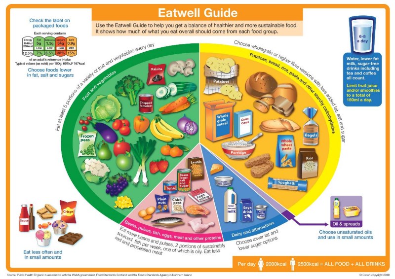
The ‘Eatwell’ Plate was relaunched as the ‘Eatwell’ Guide on 17 March 2016. The four obvious changes were: i) the name change; ii) the knife and fork disappeared iii) the images were drawn, not photographed; and iv) the segment names were tweaked again. The four main content changes were: i) the segments have been resized; ii) the purple segment (the one that used to famously have a red can of cola) now only has unsaturated oils and spreads; iii) junk foods have been removed from the ‘Eatwell’ Plate purple segment and placed to the side of the plate – giving them more prominence in my view (and why do we need any junk on the role model healthy eating guide?); and iv) there’s a new hydration message (which has no evidence base) (Ref 6).
From ‘Eatwell’ Plate to ‘Eatwell’ Guide
I did a number of posts on the relaunch of the plate to the guide, including a peer reviewed article in the BJSM exposing the fact that Public Health England appointed a panel of representatives from industry bodies to design the ‘role model healthy eating guide’ for the UK (Refs 7, 8). I also did a post highlighting the three main issues with the revised guide (this is on open view here) (Ref 9):
1) The ‘Eatwell’ Guide is not evidence based;
2) The ‘Eatwell’ Guide does not understand the difference between volume/weight and calorie intake;
3) The ‘Eatwell’ Guide is another missed opportunity to issue a three word healthy eating message “Eat real food!”
Point 2 is particularly interesting. The ‘Eatwell’ Plate and ‘Eatwell’ Guide both have recommended proportions of different food groups. The proportions are based on weight (grams of food). In my 2010 obesity book I calculated what this equated to in terms of food intake by proportion of calories. I did the same for the ‘Eatwell’ Guide. The junk intake on the ‘Eatwell’ Guide was only intended to be 3% of food intake by weight (it was 8% on the Eatwell’ Plate), but junk is so energy dense that the 3% ends up as 9% of energy intake. Conversely, fruit and vegetables are supposed to form 39% of the ‘Eatwell’ Guide (by weight). This ends up being just 8% of calorie intake. By far the major part of calorie intake is the starchy foods segment, which ends up forming between 62-68% of calorie intake (depending on whether or not junk is consumed).
The nutrition content of the ‘Eatwell’ Guide
When the ‘Eatwell’ Plate was relaunched as the ‘Eatwell’ Guide, I did a great deal of analysis on the nutritional content of the recommended intake. I intended to write a journal article and this may still happen, but other things took over and suddenly two years have passed. The radio programme at the weekend reminded me that this would be a good time to put a nail in the eatbadly coffin, so here is the analysis that I did at the time:
A number of documents were released by Public Health England (PHE) as part of the relaunch. One of these was a PDF file with sample menus for five days. The file disappeared from the PHE website quite quickly, but not before I had saved a copy. Fortunately the Daily Mail published the five menus at the time (Ref 10).
In The Harcombe Diet club, we have a tool called “MyLocker.” This runs off the United States Department of Agriculture (USDA) database and it enables people to enter their food intake and all nutrients are calculated automatically. (There are a number of apps that do the same thing). The methodology for analysing the menus was as follows:
1) I asked someone I know, (Lisa) who works for the eating disorders charity “BEAT”, to enter one of the five days into MyLocker and I did the same day manually from the USDA database (Ref 11). This was to check the accuracy of MyLocker. We chose Day 2, as this had the food items that could most easily be matched to items in the USDA database. Each nutrient was either identical or out by a couple of hundredths of a percentage. This established confidence in the tool we planned to use.
2) Lisa then entered the items from all five days to get complete nutrient analysis for the five sample menus. I then checked the items chosen to agree that the ‘best match choice’ had been made (the US database would not always have an item that matched the menu item exactly e.g. teacake!) I checked the amounts and randomly checked nutrients for accuracy. I remained highly confident in the process.
The primary goal was to establish macronutrient ratios. Once we saw the macronutrient ratios, we looked at the micronutrients. You will understand why.
Eatwell Guide Menu 2
Below is the menu that Lisa and I reviewed separately. Where the choice was not obvious (e.g. there was no breaded cod, so we selected non-breaded cod), we selected an option that was closest to real food, to be as fair as possible to the advice.
Breakfast
Porridge (50g) made with semi-skimmed milk (125ml) and water (125ml), topped with fresh blueberries (24g)
2 slices of wholemeal toast (70g) with low fat spread (10g), 1 poached egg (50g) and a grilled tomato (85g)
Cup of coffee (160ml) with semi-skimmed milk (30ml)
Lunch
Wholemeal tortilla wrap (67g) filled with cooked chicken breast (50g), low fat soft cheese (25g) and spinach(20g), served with a large side salad (100g)
Dried fruit (30g) and nuts (20g) with a tablespoon of low fat plain yoghurt (40g)
Low calorie fruit juice drink (200ml)
Evening meal
Oven baked breaded cod (125g), jacket potato topped with reduced salt and sugar baked beans (80g), served with cabbage (50g) and carrots (50g)
Tinned peaches in fruit juice, drained (200g) served with a tablespoon of fat-free Greek style yoghurt (40g)
Water (250ml)
Snacks
Plum (80g)
Apple (100g)
Teacake/fruited bun (63g)
Drinks
Cup of tea (160ml) with semi-skimmed milk (30ml) x2
Water (250ml)
Macronutrients
We repeated this analysis for all five menus. The macronutrient results were as follows (and we included saturated fat, as it was so shocking):
|
Menu 1 |
Menu 2 |
Menu 3 |
Menu 4 |
Menu 5 |
|
| Calories (cals) |
2,094 |
2,050 |
2,477 |
2,341 |
2,226 |
| Protein as % of cals |
19.7% |
22.3% |
15.4% |
21.3% |
15.9% |
| Fat as % of cals |
12.7% |
17.2% |
21.3% |
14.7% |
14.6% |
| Carbs as % of cals |
67.6% |
60.5% |
63.3% |
64.0% |
69.5% |
| Saturated fat as % of cals |
4.3% |
4.8% |
6.3% |
4.2% |
3.7% |
I had always assumed that the ‘Eatwell’ Plate/Guide resulted in the following macronutrient proportions: carbohydrate 55%; protein 15% and fat 30%. As you can see from the above, the recommended macronutrient proportions are carbohydrate 61-70%; protein 15-22% and fat 13-21%. So much for a balanced diet; that is quite staggeringly unbalanced. The one macronutrient for which we have no need is recommended to form up to 70% of our diet. Fat is not recommended to get anywhere near 30%. Menu 1 has just 13% of its intake in the form of fat. As for saturated fat, again – so much for a 10% upper limit. The reality is that the government would like us to have barely half of that amount.
Micronutrients
As soon as you see the recommended fat intake (and while entering junk like teacakes, tinned fruit and low fat spread), you know that vitamins and minerals are not going to be plentiful. Sure enough, detailed analysis of the five sample menus revealed:
Vitamin A (retinol) – the US Dietary Reference Intake (DRI – recommended daily amount) for retinol is 900mcg per day. Retinol is the form in which the body needs vitamin A. Retinol comes from animal foods. Carotene can be found in plant foods and carotene can be converted to retinol (the term ‘retinol equivalent’ is used), but the conversion is inefficient in general and extremely poor in some people (Ref 12). The average retinol intake over the 5 days was 207mcg – less than a quarter of the recommended amount.
Vitamin D – the US DRI for vitamin D is 15mcg per day. The average delivered over the 5 days was 3.7mcg – again – barely a quarter of the recommended amount. Menu 1 delivered no vitamin D whatsoever. The only day that came close to meeting requirements was menu 4, which had oily fish for dinner.
Vitamin E – the US DRI for vitamin E is 15mg per day. The average delivered over the 5 days was 6.8mg. A few sunflower seeds a day would sort this, but then they would be rich in the dreaded fat macronutrient.
Vitamin K can’t be analysed with the USDA database, as the database doesn’t account for the two forms of vitamin K: K1 coming from plants and K2 coming from animals. K2 does not appear to be included in the nutrition information. It is likely that vitamin K is also deficient, as a result of the extraordinarily low-fat menu plans.
Calcium was also missed over the five days. This averaged 958mg when recommended levels should be at least 1,000mg per day. Amusingly sodium was higher than the government would advise, averaging 2,511mg over the 5 days.
Depressingly, rather than amusingly, was the fact that sugar intake averaged 107g over the 5 days and that’s before addressing the fact that the average intake of carbohydrate was 375g a day and all that carbohydrate breaks down into sugars of one type or another. The sugar was mostly coming from fruit, which PHE doesn’t think counts as the free sugars that they measure. However, when on Day 2, 18g of sugar came from dried fruit and 21g came from tinned fruit, this is bad advice. Plus, sugar is sugar – the body knows not from where it came.
The UK government also produces a document called The Family Food Survey. This documents actual UK food intake and this reporting has been taking place since 1940, although the document title and precise content have changed over the years. The 2015 report confirmed that retinol intake was half the recommended amount (and would go even lower if people followed the recommended ‘Eatwell’ Guide menus) (Ref 13). Actual vitamin D intakes for the UK have averaged 3mcg over the past few years. The Family Food Survey also confirms the UK vitamin E deficiency.
I would look at the Family Food Survey data and conclude that the UK population is in urgent need of substantially increasing intake of fat soluble vitamins. The concomitant conclusion would be that the UK population is in urgent need of increasing intake of dietary fat to deliver those fat soluble vitamins. That dietary fat should also be of animal origin (meat, fish, eggs and dairy products), to ensure that the fat soluble vitamins are in the form in which human beings need them.
A committee of representatives of the processed food industry did not come to that conclusion. I wonder why.

References
Ref 1: https://www.bbc.co.uk/programmes/b0b86702
Ref 2: https://www.zoeharcombe.com/2016/03/eatwell-guide/
Ref 3: https://www.zoeharcombe.com/the-obesity-epidemic/
Ref 4: https://www.bosworthmedicalcentre.co.uk/mf.ashx?ID=6519630c-04f7-4a01-9c34-349e7f9f71fc
Ref 5: https://www.youtube.com/watch?reload=9&v=P4n__qtkb54
Ref 6: https://www.bmj.com/content/343/bmj.d4280
Ref 7: https://www.zoeharcombe.com/2016/06/eatwell-guide-bjsm-editorial/
Ref 8: https://www.zoeharcombe.com/2016/03/eatwell-guide-conflicts-of-interest/
Ref 9: https://www.zoeharcombe.com/2016/03/eatwell-guide/
Ref 10: Daily Mail, March 17 2016
Ref 11: https://ndb.nal.usda.gov/ndb/search/list
Ref 12: Solomons, N. W. and J. Bulux. “Plant sources of provitamin A and human nutriture.” Nutrition Review, July 1993.
Ref 13: UK Family food survey